
12.29.2011
Wired Extreme
Congrats to my friends at Wired Extreme on the new repair graphics! If you are in need of any gaming console or computer repairs, you should check them out. These guys do great work.

12.25.2011
Merry Christmas!
I hope Christmas finds you well this year! Enjoy the days off and the wonderful celebration.
"Therefore the Lord himself will give you a sign: The virgin will be with child and will give birth to a son, and will call him Immanuel."
"Therefore the Lord himself will give you a sign: The virgin will be with child and will give birth to a son, and will call him Immanuel."
12.10.2011
More Design Quotes
I stumbled upon two great design quotes today. Both are beautifully worded and express opinions similar to mine on the power of advertising that is simple, intentional, and engaging.
"To create a memorable design you need to start with a thought that's worth remembering."
— Thomas Manss
"Make it simple. Make it memorable. Make it inviting to look at. Make it fun to read."
— Leo Burnett
"To create a memorable design you need to start with a thought that's worth remembering."
— Thomas Manss
"Make it simple. Make it memorable. Make it inviting to look at. Make it fun to read."
— Leo Burnett
12.04.2011
Long Time, No Blog
I apologize for my blogging hiatus. It has been nearly two months — which is far too long. Unfortunately my readers had to suffer to the ebb and flow of my design schedule. I have been been very busy the last few months, doing work for multiple agencies in addition to my own freelance projects. Thank you for continuing to follow me and read about my work. Your support is appreciated!
10.12.2011
Happy Fall
Well it is mid October, and it is just now starting to look a little like fall in Dallas, Texas. I am equally thankful for the for a record-hot summer to be over and for the fact that I won't have to deal any sloppy winter weather for a while. I am a happy Texan.

9.23.2011
Think. Love. Feel
"A man who works with his hands is a laborer; a man who works with his hands and his mind is a craftsman; but a man who works with his hands and his brain and his heart is an artist."
—Louis Nizer
Far too often designers forget to think , love, and feel. Many firms treat designers as tools —meat machines who can create a basic layout or can "Photoshop That." Cheap advertising has turned many designers into production artists of the worst sort. We do not sell websites. We do not sell logos or print material. The role of a designer or an artist is to sell thoughts and feelings. Any designer, or piece or "artwork" or "creative" that does not seek to sell ideas and feeling should be challenged.
9.21.2011
Stickman
My Art Director sent me this link today. This is a great interactive piece with an inspiring message. (It's fun. I promise)


9.13.2011
Well, this week Facebook changed once again. This doesn't come as much of a surprise to me. It seems that a significant change to the world's most popular social network occurs about once or twice a year, and the more recent changes have been some of the best. Some of the changes are intended to make necessary improvements to web functions or user interface issues, but I suspect that a lot of the changes are intended to keep users captivated. In internet years, Facebook has been around a very long time and continues to retain original users. I think a lot of the layout changes are intended to peak interest —to keep users exploring and learning the site. Keeping users in a constant state of exploration is a great way to keep people on the site longer.
Every time Facebook changes, I see a lot of statuses protesting the new layout. Weeks later people actually enjoy the new features. This certainly proves that individuals are resistant to change. I support the fact Facebook wants to continually change and improve.
Whether or not Google Plus could be considered a real threat to Facebook, users can see a lot of Google influence in the new Facebook system. For example, the "Top News" section is beginning to look more and more like Google's "+1" system. Facebook already has such a large and dedicated community; They should change and grow in their own way, independent of what Google is doing. Even if Google Plus becomes a prized needle in a haystack, Facebook's attempt to copy them would render the world's biggest social network to look like just another haystack.
9.09.2011
Neighbor Music

Neighbor Music
iTunes —Neighbor, 'til I'm with you
9.08.2011
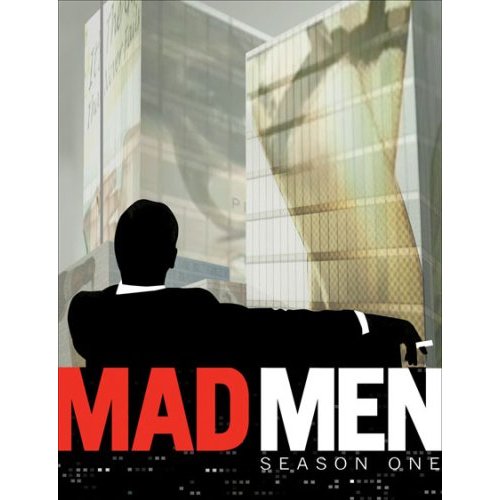
Mad Men
I have recently become infatuated with this show. Set in the 1960's, the drama follows the life of a Madison avenue Ad man. The show features brilliant advertising campaigns as well as very interesting commentary on social issues of the time period. Visually, the show is also extremely well produced which makes it an emotional thrill to watch. I would recommend it to anyone, but I feel that this show is especially enjoyable to professionals in the creative industry.
9.06.2011
Copy Writing Clichés
As a designer and often an advertiser, I find myself writing a fair amount of copy. Rarely do I write large bodies of informative or persuasive text, but almost daily I find myself creating headlines, slogans, and quick descriptions. In headlines and titles, there are so many trendy clichés that they have become noticeable to even the completely uninterested viewer.
Two of these annoying trends caught my attention multiple times this week. The first of which is "Gourmet." What does gourmet even mean now? I have seen cheesecake, pizza, pretzels, and even potato chips tagged as being gourmet. It used to mean set apart or high quality. This hackneyed term has been so overused that viewers don't even believe its original meaning these days. The only semblance of meaning gourmet has managed to hold to is that it refers to food. Advertisers have taken a relatively pretty word of french origin and twisted the mean nothing more than "edible."
Another annoying trend is the use of scare quotes —unnecessary quotations placed on words for emphasis. Not only is the obnoxious, it is also grammatically incorrect. Its looking like you have something to hide, when common terms are set apart with quotes —especially if you refer to something as "Gourmet." To the modern english reader, these scare quotes mean to stick two fingers in the air and read the word more slowly, as if stretching it out to search for hidden treasures within the typical meaning of the word. I have found myself guilty at times, using quotes for no apparent reason. It is something advertisers and writers in general need to be aware of so that it can be controlled.
8.27.2011
I have become a big fan of Google software recently. Whether it's mobile apps for my Android device or helpful little extensions that speed up and deliver inspiration to my design process, I am becoming a very devoted Google user. (Though I still have to do a lot of updating to populate my Google plus profile with all the info I currently only have on Facebook.)
One new update by Google that I really appreciate is the new web-based print dialog now built into Google Chrome. This let's users see a full-sized print preview directly in the browser. So many websites and email clients have their own frustrating printing tendencies that can now be avoided. (Or at least caught before you go wait next to the office printer) I enjoy this nifty little plug-in and look forward to see what comes next.
I also just noticed that the Facebook mobile app for Android just replaced the "Like" and "comment" buttons with a little "+" symbol. Looks like somebody is getting a little jealous of Google's new social media space...
8.24.2011
éire James
My friend James is pursuing a Masters in history in Ireland this fall. He is an incredibly avid blogger he and posts some pretty interesting stuff. His writing includes personal thoughts about Christianity, History, & Photography. He has recently established his own site dedicated to his writing. I encourage you to go check out some of his work.
éireJames.com
éireJames.com
8.23.2011
Rainbow Wheel
Dear Rainbow wheel: I hate you. I find myself constantly waiting for for my mac while humming "beach-balling" to the tune of Tom Petty's "Free Falling" in my head. It gets rather annoying.

I don't think that counts a a real blog post. Oh well. My apologies.
8.14.2011
New Plates
I got my new license plates in the mail today. I regret that I had to update to the new Texas plates. Though there is probably no such thing as a really great looking license plate, (I guess their purpose is pretty philestine) I was partial to the old Texas plates. They were Navy on white with a lot of good symbolism. Symbolism that was actually crisp and clean too. As cheesy as it was, you just have to love the cowboy, stars, and space shuttle. The new plates, however; are pretty gaudy looking. They use 3 colors, (all very bright) Rockwell Extra bold, Brush script, and a low resolution image of clouds. I don't know the designer who produced these, but I know that I would be embarassed to put my name on them. Though the standard plates are gross looking, some of the new vanity plates are actually quite nice looking. There is a line of plates that has some very nice animal illustion work on them. All procedes from these plates goes to Texas Parks and Wildlife. I am seriously tempted to buy these vanity plates because I am an avid outsdoorsman, but also because I am a picky designer.

8.13.2011
Louie's Luau
This was a slightly tacky, but really fun photo illustration I did for Bar Louie. I actually did it several weeks ago, but I couldn't publish it until after the eCard rolled out to customers. Definately not my best work, but it was fun to do something different.

8.02.2011
Guestbook Removed
Due to it's current unpopularity, I have decided to remove the guestbook page from my site. I apologize to the people who actually used it. It may come back at some point in time. Who knows, it may come back as a as a full design forum/discussion board.
7.23.2011
Nerd
I apologize for how extremely nerdy the last post was. If you are not not a designer or a complete software dork, you might as well skip that one. It will make you yawn.
7.22.2011
CS 5.5
I discovered something today that grinds my gears. As much a I love Adobe products, I stumbled accross a software decision that is more that just a little bit annoying. I use Adobe CS5 at work every single day. When I heard about the the release of CS5.5 I was a bit confused. After briefly looking at the specs, it seemed like it was just CS5 with a few more tools, brushes and plug-ins. (especially in indesign — for ePub design) I later discovered that an inDesign CS5.5 file cannot be opened with CS5. Since CS5 is far more popular (and the current industry standard) I find this annoying. I would expect this sort of thing from Apple, but not you Adobe. Luckily, there is a work around. (as with most things) You can same the CS5.5 document as an inDesign Markup file. (.idml) About half the time you have to re-link all of your images and fonts, but at least it works.
I just had to rant. Really all that I am trying to say is don't spend the extra money to get CS5.5. Stick with the equally-useful but more compatible CS5 unless you have a specific reason for needing the few new features in 5.5.
I just had to rant. Really all that I am trying to say is don't spend the extra money to get CS5.5. Stick with the equally-useful but more compatible CS5 unless you have a specific reason for needing the few new features in 5.5.
7.09.2011
Crowdsourcing
A couple months ago, I wrote an article about the dangers of "crowdsourcing" in the design world. It seems that both the AIGA and HOWdesign have recently jumped all over this topic.
Read The AIGA article
7.06.2011
D.O.E.T
I have started reading The Design of Everyday Things. (Origianlly Titled The Philosophy of Everyday Things) Thanks to JBU professor Dave Andrus and fellow designer Anna Carol Brymer for kindly urging me to read this book. I plan on enjoying it and learning from it.

7.04.2011
7.03.2011
Dr. Alex Website
That's right —Totally Web 2.0, I went there. Unlike other designers, I refuse to get stuck there. Its funny how "web 2.0" went from a new set of technologies to being a design aesthetic. Though I use the most current web standards. I will use this style only when it makes sense. Some web designers only know how to go "2.0" and find silly reasons to go CSS crazy.

7.01.2011
HDR
I am sure a lot of you designers, artists, and photographers have heard of, or use HDR imaging. (High Dynamic Range imaging) It is typically done by merging multiple exposures of a photo to gain massive amounts of color information. The result can really amplify the color and detail of photographs and illustrations. Some software can now create Psuedo-HDR images, by applying filters to a single exposure. I have used this before, and sometimes it looks great. However the fact that "HDR toning" is now an adjustment option in Photoshop CS5 does make me a little nervous. It is so easy now, that I am afraid it could become the next pointless trend. Photographers may start apply it, not because of what it actually does stylistically, but because it is an easy and dramatic option. Trends like this tend to destroy the original purpose of the effect and frustrate legitimate artists. (Comic Sans, "Outer Glow," and "Hipstamatic" to name a few prolific and annoying examples)


Above is an HDR toning edit I made in about 30 seconds. It is so easy now in CS5 that this style could become way overused. So, here is my message to artists, designers, and photographers out there: If you want to use HDR toning, please have a good reason for it, and don't over do it.
6.30.2011
Dream Theater Album Cover
Dream Theater, an a American progressive rock band, just released the tracklisting and album art for "a Dramatic Turn of Events" which will hit stores in September. I believe Dream theater to be one of the most creative bands in the heavy metal/rock genre. They really try to push musical and creative boundaries with every song. Every phrase seems to somehow connect to another song or moment in Dream Theater history. The band seems to always have great album artwork also. I don't know the artist (or artists) who do the album art for Dream Theater, but I always enjoy the work. The artwork usually plays off of some sort of visual paradox or absurd situation. This cover is no different. Congrats to Dream Theater, Roadrunner Records and the artists who worked on this and every other Dream Theater album.

6.12.2011
Design Literature
Here are some design books that have been extremely influential to my work. I recommend all of them to fellow designers. Anyone in the craive industry would enjoy (and learn a lot from) both "A Whole New Mind," by Pink and "Made to Stick," by Heath. "The Elements of Typographic Style" is basically my typography bible and refence guide for all thing typographic. "Chip Kidd: Book One" is a collection of Kidd's early work, which I find to be thoughtful and inspiring.


6.09.2011
BP Handwriting
I am excited to anounce that my own handwriting is to be used in all the new menus for Boston's Pizza. All handwritten labels were actually created with ink and textured papers, not digitally. The new menus are scheduled to roll out in early August.
6.08.2011
Bridge
In talking to fellow designers, I have been surprised to find out how few of them actually make frequent use of Adobe Bridge. It is software that is often ignored, but I have found it to be a major aid to my work process. I probably spent more time in bridge than I do in illustrator. Being a file browser, you wouldn't expect that it would be very powerful, but if you actually take a look at it you will see that it is incredibly powerful and very useful. You can view thumbnails and previews of every file type supported by Adobe. (which you cannot do in Finder, Preview, or Windows Explorer) You can also place files into any other Adobe CS program directly from bridge. This saves a lot of time and avoids the annoying issue of having to locate a file twice (First to view it, then to Place it) You can even output contact sheets and Flash galleries directly from Bridge. this program really helps my workflow, and I would encourage other designers to start using it, instead of being stuck in the OS.

6.07.2011
Go Mavs!
Cheerin' for the Mavs tonight! To make this more relevant to design I will also mention how much I love the Mavs logo. Well, one of them that is. I can't stand the orignal logo (with the capital M and the basketball.) I am very surprised to see that the Mavericks continue to update and use this mark. The Horse logo is used much more often, but every once in a while the "M" logo slips through. (like on this year's Western Conference Champion's hats) The team's branding would be even stronger if they used only one logo and trashed the original, instead of confusing people with two very different marks. The horse logo is strong and aggressive as a sports logo shold be, but it also depicts a "Maverick" well without being too illustrative or too abstract.

5.30.2011
Gum Vote Poster
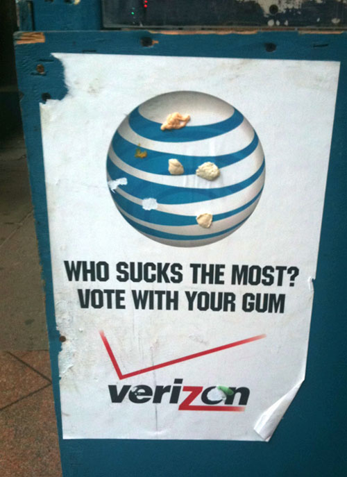
http://www.logodesignlove.com/vote-with-your-gum
5.24.2011
Good Design is...
Here is an interesting quote that I found today. These seem to all be very good goals to keep in mind for every project. I wish a lot of advertisers would pay more attention to points 5, 6, and 10.
- Good design is innovative.
- Good design makes a product useful.
- Good design is aesthetic.
- Good design makes a product understandable.
- Good design is unobtrusive.
- Good design is honest.
- Good design is long-lasting.
- Good design is thorough down to the last detail.
- Good design is environmentally friendly.
- Good design is as little design as possible.
— Dieter Rams (1985)
5.22.2011
Bored

5.21.2011

5.20.2011
Bar Louie Poster

5.17.2011
Bar Louie
Previously Chicago-based chain "Bar Louie" is now headquartering in Dallas. Their style is a mix of class and irreverence hidden behind grunge texture. I have been working on some interesting artwork for Bar Louie with the Thomas Agency in plano. I hope to be posting pictures soon.
5.11.2011
Crowdsourcing
I have spent some time researching and writing on the new and dangerous trend of "Crowdsourcing." This is directed to both other designers, aspiring artists, and clients. The full article is listed below.
PGM Logo
Congrats to Genie Price and Photo Graphics Magic on the new logo! I am happy how it turned out. Working with Genie was great, and I hope to work with her on many future projects!
5.10.2011
Web Updates
Just updated my website: polished up the stylesheets, added a scrolling blog, added a few new logo marks to the home page animation. Thanks for visiting!
5.07.2011
JBU Graduation
It was great to see so many friends graduating from JBU today! I am already missing them like crazy. It was also impressive to see how many design majors graduated this year. I love knowing that JBU's Art department is great and becoming the strongest program in the school ranked No. 2 in the South
5.02.2011
AC
Just created and programed a portfolio site for Anna Carol Brymer.You should go check it out. I happen to think that she is one cool chick.
2.13.2011
Conceptual Logo Design
My Newest Logo. Namaste is a high-end boutique hotel known for being a relaxing spiritual oasis with 5 star level of service and commitment to detail. The hotel is located on top of a mountain overlooking a lake, mountain range and vineyard. The color provides a peaceful feeling. The underlining arch supports the name, as well as reminds guests of the scenic view. The type itself is tradional and classy, yet open and relaxed.

1.25.2011
Travel
I am going down to check out the Mecca of Graphic design, crowded bars, and live music: Austin, Texas.
I hope to see some nice work and have some fun.
1.16.2011
SBMX
Today I really learned that Sketchbook Mobile Express (Android Market) can be a great way to generate ideas, or doodle before a client meeting. I'm glad to have an app that lets me explain my ideas when I don't happen to be carrying a clean sheet of paper and colored markers.
1.10.2011
Logo Work
I started work on a couple new logo projects today. I'm excited to see how they turn out. I will hopefully post them when I am finished.
Subscribe to:
Posts (Atom)