8.21.2013

Literally Bothered

I tend to live more on the creative-direction and art-direction side of things, but I do my fair share of copy-writing as well.  In writing, I have developed a love/hate relationship with the rate at which the English language evolves. Being that English at its core is just a conglomerate of Latin, Greek, Arabic, and just about anything else you can throw on the table, American English is one of the most mishmashed and fastest evolving languages in the world.  We have gone as far as to believe that our current speech and common usage transcends all historical usage.  Instead of understanding words referenced in our history (understanding what they mean and using them correctly) we function on a vague notion of the meaning and expect people to understand and adapt to our usage.  I could easily use the whole world of meaningless marketing jargon is a testament to this.

In many ways this can be a good thing—allowing words to bend but not break, and providing a greater gamut of self-expression within common language. Other times, it just goes too far.  I have heard individuals misuse the word "literally" for some time now. I am pretty sure all (or a least the vast majority) of those people know the literal definition of the word, but instead use it as a filler word or to sound smarter. I believe this stems from a lack of confidence in our lingual abilities. As writers and speakers we feel that hyperbole is necessary to communicate a strong point. "Literally" is one of the best examples of this trend that I have seen on the last few years. It is becoming a word that loses all meaning because of misuse—not unlike a loud pre-teen's use of "like," "such-as," "hashtag," and "totally."

In very informal friendly speech this does not bother most people (myself included) It is when our laziness and need for exaggerated conversation actually changes our vocabulary and dictionary that we should reflect. Recently, Google, Mirriam-Webster, and Cambridge dictionaries have all changed their definitions of the word "literally" to include something along the lines of "not actually true, but used for emotional expression or exaggeration." With this definition, we have created the first English word that can be used as its own antonym.  We are creating words that can effectively have no meaning. Our use of these worlds is for drama alone—coloring our message, but not actually contributing to our communication. This reminds me of the old "form-versus-function" debate common in architecture and design.  I am a believer that both form and function can and should be utilized for effective communication, both visual and lingual. If you feel a need to include a "flavor" word that doesn't actually have a relevant meaning, then try to avoid it.

Below is the link to the CNN story about the dictionary change and the new adapted use of the word "literally." Please comment on my page and let me know if you think this is as crazy as I do.

http://www.cnn.com/2013/08/15/living/literally-definition

6.10.2013

iOS7 Smartphone UI Design


Smartphone UI Design
iOS7 Following Windows and Android with flat design and bright colors.

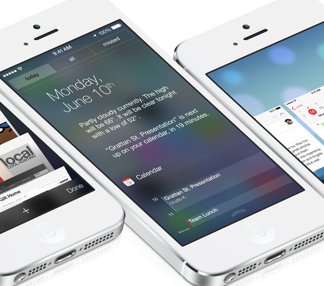
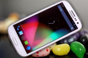
Today, Apple released the new user interface design for iOS 7, or as many call it "Samsung Touchwiz." The war between Apple and Samsung continues as iOS threw away its  existing style to follow the direction established by Google's "Jelly Bean"  OS and the Samsung user interface that lives in the Galaxy s3 and s4.  Any contemporary Android user will notice that the new Apple interface looks like the environment that they have been comfortable in for about a year. The actual Apple release can be found here.


Years ago, Apple led the charge in creating the newest product and user interface aesthetic, with sleek, shiny design featuring punchy shadows, crisp reflections, and minimal color.  Many companies tried to copy "The Apple Look." Some were successful, but all were still overpowered by the originator of the design.   Almost in rebellion,  companies started playing with drastically different looks, just to see what else could catch on.  After some evolution, both Microsoft and Google independently changed their user interface to feature large, bright, blocky colors—on usually a solid or blurred background.  As an Android user, I embraced the new direction.  Some third-party applications went a little too far with the neon-bright colors that stand out like GAP skinny jeans.  but for the most part the direction works well.

For the most part I like that Apple went this direction.  I enjoy the aesthetic of the the text based applications. (messages, email, Siri, calendar, etc.) The bright colors work, but Apple went too far with the cheeseball gradients on the icons—to the point that it begins to look like a powerpoint using all the horrible button colors possible.

The thing that most surprises me about this change, is the notion of Apple wanting to follow consumer trends (opposed to creating their own)  The are throwing away the very distinctive "Apple Look" for the sake of looking more like the competition.  Though it looks good, this is a strange move for Apple, a company that thrives on the stylish countercultural identity that slowly becomes mainstream.

This is a classic mistake, where business and numbers rule the design.  "That look is selling really well right now. Let's look more like that!" Throwing away brand identity and your own potentially unique trends for the sake of following suite.  In this particular case, the interface change will continue to blur the lines between devices.  Making the look of Apple products less and less unique.

There have been rumors of a new iphone "5s" release featuring plastic casings available in a wide gamut of highlighter-bright colors. This new user interface direction makes a little more sense if the rumor is true, but also makes it that much more overwhelming.

In conclusion, I love the idea that Apple is becoming a little more fun and less pretentious, but I am shocked at this design move.  If you want something that has a bright, customizable user interface then go purchase a Galaxy S4 or HTC OneX.  If you want something that looks steady, predictable and easy to use, go buy a iPhone. This new interface just muddles the two schools of thought.


5.03.2013

Stupid, But Not Racist. PepsiCo MTN Dew Ad

There is has a lot of hype and media freak-out revolving around Pepsico's supposedly "racist" MTN Dew internet video.  Before you form an assumption, please actually watch the video and make your own opinion. (hopefully the video doesn't get pulled from YouTube)


Some are going as far as to call this "The most racist ad ever." To anyone making that claim, I would say get off your high horse and actually go study advertising history—this doesn't even come close.

In hopes of creating something original and avant-garde, the project was given to a hip-hop artist.  He definitely created something different and bizarre. The whole concept of the ad is to use a strange, unpredictable storyline to hold your attention while dropping the product name and image as many times as possible.  The "police line up" scene is the most controversial, accused of making a statement of the black community as a whole. In fact, the hip-hop artist who created the ad used other members of his hip-hop group in the scene as a subtle way to promote the group. (with no regard to race) To make a racist assumption about  this scene shows a racist perspective of the viewer, not a racist intention by the creator.  Though I don't believe the ad to be racist and controversial, I don't think it quality advertising.

Overall, Americans are very uptight and P.C. these days. If you are going to use lowball humor, at least make it clever and effective.  Another controversial ad, the K-Mart "Ship my Pants" video does a great job of this. (despite many railing against the use of an implied poop joke) The ad was clever and put Kmart back on the map for a lot of online shoppers.  The MTN Dew ad was nowhere near as punny and clever.

Though I don't consider this ad "racist" or "an offense to women" I do consider it a fail for PepsiCo PR.  This ad was a guerrilla, viral, internet spot—not a major network ad. If Pepsico PR had basically said "don't worry about it" it would have been no big deal.  The fact that the ad was pulled, and PepsiCo has been both defensive and playing dumb (with "well, I didn't approve it" type comments) has made it into a much bigger issue. (now being picked up by news sources and bloggers across the nation, myself included) Hiding your content and assuming wrong, even when not intended, makes it looks like there is something to hide, and certainly does nothing positive for PepsiCo.  Trying to be P.C. and then hide when someone takes offense is a lot more complicated and damaging than trying to just focus on good work, and then take responsibility for the work you put out.


** Just to clarify —I have worked with PepsiCo before, but have no connection to this project.  This post is for commentary only and does not express the views of PepsiCo nor any of their affiliates.


4.16.2013

DC Cherry Blossom Festival

I recently took a 3 day trip up to Washington DC. I was in the capital city on what was probably one of the most beautiful weekends of the year.  The annual Cherry Blossom Festival was in full swing as the trees climaxed in brilliant shades of pink, purple and white.  I spent a good portion of my trip looking trough my camera lens, trying to capture the beautiful blossoms and the national monuments enhanced by the incredible weather.

As a designer and a marketer I spend a lot of time researching aesthetic trends, or deep in editing software behind a large Apple monitor.  This trip was just another reminder of something all creatives (and probably all people in general) need to do more.  Go outside. Be inspired. Whether deep in the city or in rural America, we all are surrounded by some form of beauty—go out and find it.  To an analytical world, it is the difference between  reading Thoreau's Walden, and actually going out for a nature hike.  Even studying the classics can be hampering at times. (I know many people who can babble on about art history all day long, but simply forget to feel) Whether you know anything about art and design or not, it is important to seek beauty, and let it influence you.

More photos in the link below:
DC Photos

1.14.2013

2013 Style Predictions


As we begin 2013, we will see continuation of several style & marketing trends from last year. A lot of aesthetic and design ideas will stick around or even grow, but several have already run their course.  Here are some of my predictions to things we may see in the next year.


  1. Creative Page Scrolling on Web Sites.  This just makes sense. With the continued dependence on phones, tablets, and "phablets," as well as the design of the Windows 8 Aesthetic (which will probably be spreading more this spring) increased thought on page scrolling will be important.  This will include more single-page, long-scroll type sites.  Scrolling navigation obviously will not replace link navigation, but as it is very intuitive and user friendly on portable devices, scrolling interactions will become more common as well as more interesting.  Overall, I would consider this a win for the web, as scrolling rich media can provide a lot of user interface options not available in simple text-markup. 
  2. Pinterest won't be cool anymore. The online pinboard site is certainly not going to disappear, in fact it will see continued growth in 2013, but its overall usefulness and excitement will decline. Marketers and producers will realize how difficult it is to bastardize a user-generated content site like Pinterest. The Pinterest trend was wild in 2012, but the "new-car smell" will  begin to wear off this site, and it will take a back seat to other social media sites.  Integration into other social media platforms will become more prominent—especially as a sharing tool—but the hours of just browsing Pinterest will probably decrease, as it now has more competition, and has become more commonplace and less remarkable since last spring. 
  3. Bright Solid Colors. In 2013 we will see some intensely strong, but simple color palettes. This was a huge fashion trend in 2012 that will probably roll down into other artforms and styles. Bright hues are typical for summer, but this year they continued into fall and winter-wear.  This means there will probably be a slow shift in fashion away from this style, but now that the look has been established, it will hang around in other media forms for a little while. Color tones will be vivid and strong, but not necessarily the 80's neon colors we saw last summer—Jewel tones are probably a likely candidate for this trend. 
  4. QR Codes. Unfortunately this marketing trend won't die entirely, but we will finally start to see a decline in the use of QR codes mid year as marketers and business professionals finally realize that the "cool factor" (sigh...) of QR codes does not equal effective communication. 
  5. Web Typography.  Until the last few years, web designers have basically been limited to about 8 or 9 universal fonts. (I refuse to count Comic Sans) Web loading fonts have become more prominent recently with services like Google Web Fonts and Font Squirrel and the CSS3 @font-face rule. Designers will continue to use and explore this capability, expanding traditional print design styles into web and digital worlds.  This will allow for better typography and design as front-end designers (and traditional designers taking on more digital work) will not be as limited.
 If you have any other ideas that you feel may dominate the design world in 2013, or want to debate/discuss any of my predictions please comment below!

1.08.2013

QR Codes — A Marketing Trend that Needs to Die.

QR Codes have been around for nearly twenty years. Until the last few years this technology has lived behind the scenes—in a functional world not designed to be consumer facing at all.

Universally, I think most good designers would agree that the QR trend has gone way too far.  Though the technology is very interesting, and admittedly has a lot of potential, these  digital patches rarely do more than get in the way when the primary audience is human eyes.  When "QR-Reader-Vision" becomes an accessory to laser  eye surgery, these scan codes will be a successful way to share information to humans. Until that day, I strongly recommend against using QR codes for marketing purposes when that is any other option.  Its really the same reason I would recommend against using a Spanish headline in Japan—any primary message that cannot be understood by the person viewing it is not only a waste of space, but utterly confuses the rest of your message.

From my experience, the use of these codes is usually pushed by the business/marketing side of an operation and not by art-directors or designers.  Whether a left-brained business pro or a right-brained creative genius, we can look at the numbers to show how many people are actually using these scan codes to access information.  Forbes published  an interesting article documenting this.

Are QR Codes Dead? —Forbes

Marketing trends come and go, but for some reason this one has hung around slightly longer than usual despite its ineffective prominence.  As designers, marketers, culture-makers, and business professionals lets try to start 2013 right and make this the year that QR codes die.


1.02.2013

A New Year


Here's to another great year of fun inspiration, exciting projects, and creative concepts. 
Happy New Year, folks!