Smartphone UI Design
iOS7 Following Windows and Android with flat design and bright colors.
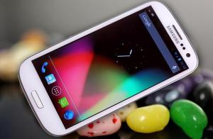
Today, Apple released the new user interface design for iOS 7, or as many call it "Samsung Touchwiz." The war between Apple and Samsung continues as iOS threw away its existing style to follow the direction established by Google's "Jelly Bean" OS and the Samsung user interface that lives in the Galaxy s3 and s4. Any contemporary Android user will notice that the new Apple interface looks like the environment that they have been comfortable in for about a year. The actual Apple release can be found here.
Years ago, Apple led the charge in creating the newest product and user interface aesthetic, with sleek, shiny design featuring punchy shadows, crisp reflections, and minimal color. Many companies tried to copy "The Apple Look." Some were successful, but all were still overpowered by the originator of the design. Almost in rebellion, companies started playing with drastically different looks, just to see what else could catch on. After some evolution, both Microsoft and Google independently changed their user interface to feature large, bright, blocky colors—on usually a solid or blurred background. As an Android user, I embraced the new direction. Some third-party applications went a little too far with the neon-bright colors that stand out like GAP skinny jeans. but for the most part the direction works well.
For the most part I like that Apple went this direction. I enjoy the aesthetic of the the text based applications. (messages, email, Siri, calendar, etc.) The bright colors work, but Apple went too far with the cheeseball gradients on the icons—to the point that it begins to look like a powerpoint using all the horrible button colors possible.
The thing that most surprises me about this change, is the notion of Apple wanting to follow consumer trends (opposed to creating their own) The are throwing away the very distinctive "Apple Look" for the sake of looking more like the competition. Though it looks good, this is a strange move for Apple, a company that thrives on the stylish countercultural identity that slowly becomes mainstream.
This is a classic mistake, where business and numbers rule the design. "That look is selling really well right now. Let's look more like that!" Throwing away brand identity and your own potentially unique trends for the sake of following suite. In this particular case, the interface change will continue to blur the lines between devices. Making the look of Apple products less and less unique.
There have been rumors of a new iphone "5s" release featuring plastic casings available in a wide gamut of highlighter-bright colors. This new user interface direction makes a little more sense if the rumor is true, but also makes it that much more overwhelming.

 In conclusion, I love the idea that Apple is becoming a little more fun and less pretentious, but I am shocked at this design move. If you want something that has a bright, customizable user interface then go purchase a Galaxy S4 or HTC OneX. If you want something that looks steady, predictable and easy to use, go buy a iPhone. This new interface just muddles the two schools of thought.
